-40%
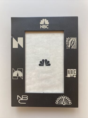
NBC Logo History - Picture Frame - VERY RARE
$ 10.56
- Description
- Size Guide
Description
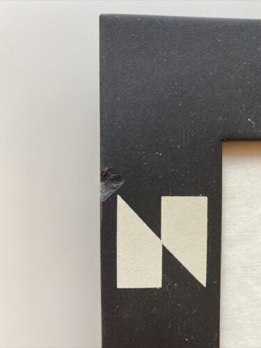
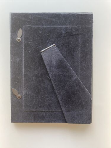
This is a black picture frame featuring several of NBC's most popular logos through the years. It is very rare and was an executive gift in the early 2000's.There is a small nick in the top left of the frame. See photos.
Microphone Logo (1943–1946):
In 1943, NBC introduced its third logo, a microphone surrounded by lightning bolts, which was a modification of the original 1926 logo used by the NBC radio network. Lightning bolts were also part of the logo of corporate parent RCA, as well as that of one-time sister company RKO Pictures. The waves on the left side were meant for the radio network, and the right waves were meant for the television network.
NBC Chimes Logo (1953–1959):
In 1953, a stylized xylophone and mallet were introduced, symbolizing the NBC chimes, which were first heard on NBC radio in 1927 as a seven-tone sequence. The current tones – which were first adopted in 1929 as a simplified cue for identification of its radio affiliates because of issues with orchestrating the seven notes properly – are only three notes, G, E' and C'. There is some indication that the xylophone logo was used at 5:32 p.m. Eastern Time on December 17, 1953, to announce the Federal Communications Commission's (FCC) approval of the new color standard, which would go into effect 30 days later. This logo debuted in December 1953, during the Tournament of Roses Parade.
Laramie Peacock (1956–1975):
In 1956, John J. Graham and Herb Lubalin of Sudler & Hennessey designed a new symbol for the network: an abstraction of an eleven-feathered peacock indicating richness in color. This brightly hued peacock, which NBC called the "Bird", was adopted due to the increase in color programming. Several modifications were made by NBC before the emblem made its first on-air appearance on May 22. The most famous version of this appeared in 1962, during a telecast of the Western series Laramie, leading it to be dubbed the "Laramie peacock," and would continue to be used until 1975.
NBC Snake (1958–1975):
Starting in late 1958, a new animated logo designed by John J. Graham joined the Peacock logo, appearing at the end of every show. Starting with the "N", each letter would grow from the other, forming a stacked typographic logo featuring an "NB" ligature with the "C" forming the base. This would be known as the "NBC Snake". Several versions of this exist; the first is the snake forming in front of a multicolored background while an RCA TK-40 or TK-41 camera passes by with a jazz rendition of the NBC chimes, while the second consists of the snake forming against a color-changing background, going from blue to green to red, on each note of the regular, automated NBC chimes.
N Logo (1975–1979):
NBC updated its image in October 1975, with the introduction of an abstract "N", a bold, bright and contemporary design consisting of two trapezoids – one red and one blue. One of the technological innovations of this logo was its use in the first electronically animated ident for an American television network.
Proud N (1979–1986):
The Peacock returned as part of NBC's branding in September 1979. The "N" and the Peacock were combined together to create a design called the "Proud N", designed by Lippincott & Margulies. On several occasions, the new, simplified Peacock was used on its own, starting with the new "Proud as a Peacock" advertising campaign; however, the "N" and the Peacock were usually combined together between 1980 and 1986. However, unlike the original Peacock design, which had featured eleven different colors, this version only used six colors for all eleven feathers.
NBC Futura Peacock Logo (1986–2010):
On May 12, 1986, during the finale of the NBC 60th Anniversary Celebration special, past and present NBC stars stood on stage to introduce a new logo: a simplified peacock icon, ending the arranged "marriage" of the "N" and the peacock. The peacock's head was now flipped to the right, as to suggest it was looking forward to the future rather than back to the past, and the white plume on its head was eliminated. The bottom portion now also resembles a film canister. The peacock's feathers are now shortened to six and include the six primary and secondary colors in the RYB color palette to represent NBC's six divisions: yellow for news, orange for sports, red for entertainment, violet for stations, blue for network, and green for productions. This peacock, designed by Steff Geissbuhler at Chermayeff & Geismar, remains one of the world's most recognized logos. The network maintains specific guidelines for the logo, including proper colors for reproduction, using either RGB, CMYK or Pantone colors. A new typeface was also introduced: NBC Futura, still used for some affiliations and some of its divisions such as NBC News and NBC Olympics, as well as its Spanish-language network Universo.
